Does Your Brand Look Like Everyone Else? How to Build a Unique Visual Identity
Your brand is so much more than the product or service you sell. Your brand encompasses everything from your visual identity to your values and how you interact with your audience and the world around you. Crafting a unique approach in each of these areas is vital to your ability to stand out in a crowded sea of competitors. But one of the most important things to get right from the get-go is your ‘look’ – your visual identity.
Think of globally recognizable brands like Coca-Cola and Nike. You probably see their logos in your mind’s eye before you even think of their products. They’re simple but unique, and highly memorable. These are all traits you want your brand’s visual identity to encapsulate. No matter how saturated your market may be, a strong logo and visual strategy can help your brand make its mark. So why do so many brands look similar today?
In this guide, we’ll explore the trends influencing some brands to give up their signature style, as well as give our recommendations on how to build a cohesive visual identity that capture’s your brand’s personality while still being flexible enough to adapt with the times.
The rise of “blanding”, or why so many brands
look similar today
Let’s jump right into the potential elephant in the room. Just why do so many brands look alike? While it’s hard to pinpoint an exact reason, it’s clear that around 2017, some companies decided to forgo their old logos for something a little more modern. At first, it was fashion brands that led the charge, with brands like Balenciaga and Gucci undergoing a visual rebrand, opting for a sans serif font for their logos.
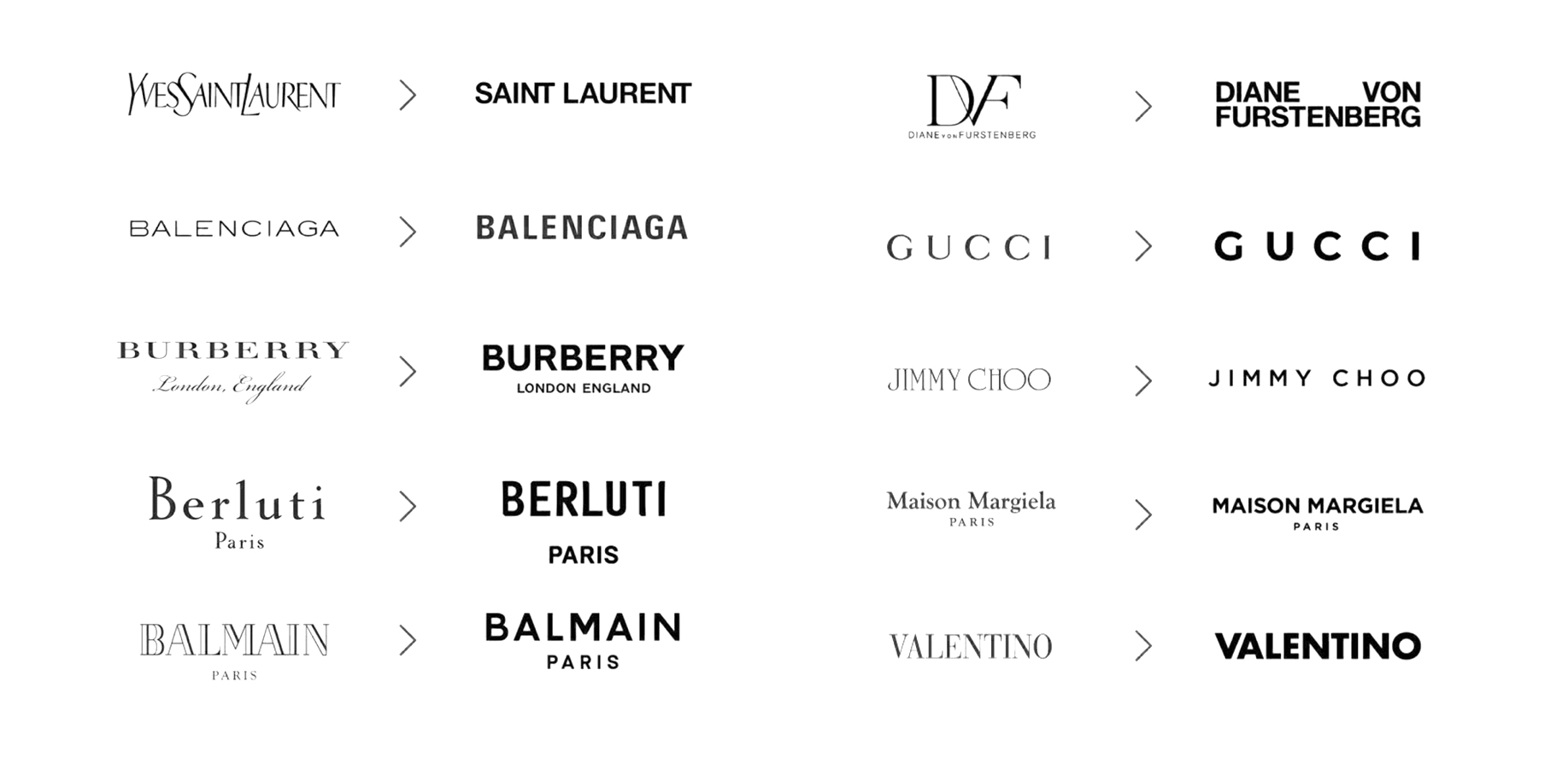
This proved to be quite the popular change, with several other brands following suit. But the change didn’t stop with the fashion industry. Soon, big tech brands like Spotify, Microsoft, Airbnb, and more followed. Another big visual trend that sprang up around that time was the explosion of “millennial pink” and other soft, muted pastel colors. And while the use of millennial pink has somewhat taken a step back in the last year or so, the sans serif font still stands as a go-to choice for a variety of brands.
And while it may seem counterintuitive to drop an eye-catching, one-of-a-kind logo for something a little blander, there are a few thought-provoking reasons why these brands may have made the change.
Simplification
There’s something crisp and modern about a sans serif font. And in a time where minimalism is one of the dominant aesthetics in design, it makes sense some brands would embrace a pared-down logo. There’s also an argument to be made that, as a brand grows larger and seeks to create a broader, wider audience, a simpler logo looks much more trustworthy, reliable, and in some cases, luxurious.
Readability
Another possible reason brands are leaning into the sans serif look is simply due to its readability. Sans serif fonts were created in the early 1800s for this purpose exactly, ensuring clarity and readability in a variety of mediums, sizes, and distances. Today, it’s important that your logo and other text elements are clearly legible wherever your audience may find them, from your mobile site to a huge billboard.
Leaving behind the era of the logo
Brands will always need a logo, of course, but the utility of a unique logo is diminishing, one could argue. Strong brands like Gucci or Microsoft are overwhelmingly defined by their products today, not their logo. Instead of their logo cluing people in to their personality or concept, the brand itself has become so ubiquitous that that is no longer needed.
Of course, all of these points have strong counterarguments to be made as well. When it comes to building out your visual branding strategy, it’s important to consider the full picture before deciding on a direction for your brand.
To fit in…or to stand out?
So with that being said, is it better to fit into today’s minimalist, modern branding, or carve out a bolder visual identity? While a great design agency can help guide you through the process to create something that resonates with both you and your target audience, you will need to be the one to chart the initial course, so to speak.
To help you figure out what path makes the most sense for your brand, we’ve laid out a few key considerations and questions to think about.
Consider your audience
Who is your audience? Different visual styles resonate with different groups. For example, a no-frills, cut-and-dry look might work with men of a specific demographic, while a trendy brand looking to capture Gen-Z women would be more likely to take a maximalist approach with bold colors and fun fonts. Knowing your target audience – how old they are, where they live, their values, etc can help you hone in on the best strategy for your brand’s visual identity.
To get a better idea of what’s working well with your ideal cohort, make it a point to see what your competition is doing. What are the top brands in your category doing, and are there any gaps you can exploit? Sometimes it works to simply take a particular design trend and make it your own – other times, in order to stand out, you might have to reinvent the wheel.
Take your value proposition into account
What do you offer that’s unique from other brands? Maybe it’s the quality and authenticity of your product or service, or perhaps it’s your brand’s purpose-driven values that make you different. When you’re deciding how your brand should look, take into account how your visual design choices can communicate that value proposition intrinsically.
Or, you can opt for the opposite approach, where a minimalistic design philosophy lets consumers project their own ideals and values onto your brand.
Find inspiration from your own favorite brands
What are your favorite brands (from any category), and what do they do well in terms of design? Studying up on brands that have made an impact on you and your team can help reveal potential patterns and shared ideas around what makes a great brand design. The end goal being not to copy what made those other brands successful, but to potentially apply any lessons you’ve learned from them into your own strategy.
What goes into creating a unique visual brand identity
Once you’ve taken the time to consider what general path you want your brand’s visual identity to follow, you can then explore each of the specific elements that will make up your branding in greater detail.
Your agency partner will work closely with you to develop a variety of key visual branding elements, including:
Naming
What’s in a name? Everything. As we like to say, naming your brand is on the same level as naming a baby. A great name distills the essence of your brand down to just a few words or less. It should be easy to read, easy to remember, and most importantly, it should immediately evoke a feeling within your audience. The feeling could be warmth, trust, competence, or any number of emotions. Your name just needs to be able to communicate that feeling. We’ll help you craft a name that speaks to your brand on a soul-level, and take care of all the technical logistics that go with naming as well.
Logo
A great brand name and a well-designed logo are like peanut butter and jelly – on their own they’re fine, but the real magic happens when they’re put together. The best logos take whatever feeling your brand name evokes, and translates that into something people can experience visually. As such, it’s important to get your logo exactly right. You don’t want it to clash tonally or emotionally with your brand name, and you don’t want it to be overly complex as well.
Another consideration up and coming brands should make in today’s world is the versatility of their logo. Could the color(s) of your logo be swapped around based on a predetermined brand color palette for different occasions? Is your logo crisp and clear enough to look good on the smallest of social media posts? Your brand agency will help you address these questions and more as you move forward in the logo design process.
Visual direction
Your visual identity goes far beyond your logo. Your art direction is the umbrella under which all other visual assets for your brand will live. These include graphics and illustrations, as well as photography. The goal is to create a library of visual assets that complement your logo, and can be mixed and matched to create different branding materials, from email headers to social media templates.
Brand voice
What you say as a brand, and how you say it matters. Getting your tone of voice just right is key to not only resonating with your target audience, but making sure your messaging comes across exactly how you want it to. Visually, you want to complement your voice with the right choice of fonts, letter casing, color, and more. Your visual assets help communicate your brand voice as well. For example, using photography of young, smiling people could help communicate that your brand is youthful, cheery, and friendly.
Brand style guide
Think of your brand style guide as the backbone that holds up each of the other elements we just discussed. A style guide outlines exactly where, how, and when different aspects of your visual identity should be used. It lets your entire team know what’s on-brand, and what’s not. For instance, it can help your social media team create Instagram templates that align with your brand’s color palette and approved fonts to create a beautifully consistent feed.
How we can help
If you think of brand strategy as the blueprint for your brand, then brand creative – or brand identity – is the foundational design and messaging elements of your brand. As a creative marketing agency, we love working with businesses big and small to help define the look and feel of key brand elements.
When it comes to the look of your brand, we start with a logo design, then move on to a color palette and other elements like typography and iconography. These visual aspects are applied across the board for brand consistency and recognition, for both internal and consumer-facing deliverables, including your website, business cards, letterhead, social media channels, trade show elements, digital ads, and so on. In addition, we help you set the tone and voice of any copy for your consumers. This way, when consumers engage with your website, a social media post or sales brochure, your consumers will connect with your brand because you are consistent with your look and messaging, which ultimately fosters brand recognition.
Ready to take your brand design from concept to reality? Get in touch with the Citizen Best team today. We can’t wait to meet your brand.